
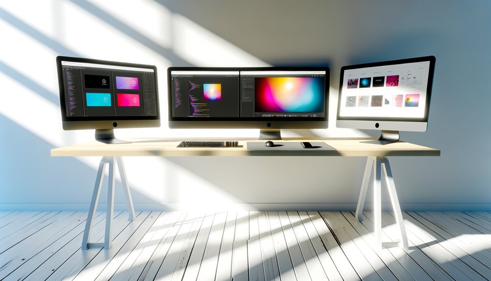
Best-Monitors-For-Web-Design
Selecting the right monitor for web design is essential for achieving ideal results. Color accuracy, high resolution, and IPS panel technology greatly enhance visual quality. Features such as adjustable stands and multiple connectivity options further improve user experience. As the demands of web design evolve, understanding what to prioritize can make all the difference. The following sections will explore fundamental factors and recommendations to help designers enhance their work.
Key Takeaways
- Look for monitors with high resolution (4K or higher) for detailed visuals, crucial for intricate web design work.
- Choose IPS panels for superior color accuracy, ensuring your designs appear consistently across different devices.
- Consider monitors with adjustable ergonomic stands to promote comfort and reduce strain during long design sessions.
- Ensure a variety of connectivity options (HDMI, DisplayPort) for seamless integration with your devices and peripherals.
- Opt for monitors with high refresh rates for smoother visuals, enhancing the overall user experience while working on dynamic designs.
Importance of Color Accuracy in Web Design Monitors
Color accuracy stands as a critical pillar within the domain of web design, influencing not only aesthetic appeal but also user engagement and brand perception.
For designers seeking creative freedom, employing effective color calibration techniques and monitor profiling methods is vital. These practices guarantee that the colors displayed on-screen mirror the intended vision, fostering an authentic connection with users.
A monitor with superior color accuracy empowers designers to make informed decisions, leading to compelling visuals that resonate with audiences.
Resolution: Finding the Right Balance
In web design, achieving the perfect resolution is essential for ideal visual impact. High pixel density guarantees that designs are sharp and detailed, while the right aspect ratio improves usability and viewer experience.
Coupled with stringent color accuracy requirements, these factors create a harmonious balance that raises the quality of any web project. Understanding Core Web Vitals is crucial for ensuring that your designs not only look great but also perform well across different devices.
Importance of Pixel Density
Achieving the ideal pixel density is essential for web designers aiming to deliver sharp, detailed visuals. Higher pixel density benefits include improved clarity, allowing designers to view intricate details without strain. This optimization enhances workspace efficiency, enabling a seamless workflow. Understanding CSS layout techniques is crucial for creating visually appealing designs that work well across different devices. Additionally, familiarity with machine learning applications can further enhance design processes by providing insights into user interactions and preferences.
| Pixel Density (PPI) | Benefits | Ideal Use Case |
|---|---|---|
| 72 | Basic graphics | Web content |
| 150 | Moderate detail | UI/UX design |
| 300 | High detail | Print and high-res work |
Focusing on pixel density empowers designers to create compelling, professional work that resonates with viewers and stands out in a crowded digital landscape.
Aspect Ratio Considerations
While selecting a monitor for web design, the aspect ratio is essential in optimizing the workspace and enhancing productivity.
A widescreen monitor offers significant benefits, allowing designers to view multiple applications simultaneously without compromising clarity. This feature not only streamlines workflow but also creates a cinematic experience, immersing users in their creative tasks.
Choosing the right aspect ratio can dramatically impact design precision, making it easier to visualize responsive layouts across various devices.
Ultimately, a well-proportioned monitor empowers web designers, granting them the freedom to explore their creativity without limitations, ensuring their work stands out in an increasingly competitive digital landscape.
Color Accuracy Requirements
Color accuracy is paramount for web designers, as it directly influences how their work is perceived across different screens and devices. Achieving ideal color fidelity requires adherence to established color space standards, ensuring that designs translate seamlessly across platforms.
Employing effective color calibration techniques enhances monitor performance, allowing designers to trust their visual output. This commitment to precision empowers creatives to express their visions freely, knowing their work will resonate authentically with diverse audiences.
Investing in monitors that excel in color accuracy not only boosts design quality but also fosters a sense of confidence and freedom in the creative process.
Screen Size and Real Estate Considerations
When selecting a monitor for web design, understanding screen size and real estate considerations is essential for ideal productivity and creativity.
The right screen dimensions can dramatically enhance workspace optimization, allowing designers to work efficiently.
Consider these factors:
- Resolution: Higher resolution provides clearer visuals.
- Aspect Ratio: Wider screens offer more horizontal space for multitasking.
- Physical Size: Larger monitors reduce the need for multiple displays.
- Adjustability: Ergonomic stands can improve comfort and focus.
Investing in a suitable monitor empowers designers to release their creativity while maximizing their workspace potential.
Connectivity Options: What You Need
Choosing a monitor with the right connectivity options is essential for web designers who depend on smooth integration with various devices and peripherals. Display ports, HDMI, and USB-C are critical for multi-monitor setups, enhancing productivity. Wireless connectivity options can further streamline workflows, eliminating cumbersome cables. Understanding adapter requirements is important for seamless connections, particularly with older devices. Effective cable management not only guarantees a tidy workspace but also improves airflow and accessibility.
| Connectivity Type | Advantages | Considerations |
|---|---|---|
| Display Ports | High resolution | Specific cables required |
| Wireless | Reduced clutter | Potential latency |
| HDMI | Universal compatibility | Limited distance |
Top Features to Look for in a Web Design Monitor
Having established the importance of connectivity options for smooth incorporation, it becomes clear that other features considerably impact the web design experience.
A monitor must embody the essential characteristics that empower designers:
- Monitor brightness: Guarantees vivid colors and clarity in various lighting conditions.
- Refresh rate: A higher refresh rate provides smoother visuals, vital for dynamic designs.
- Resolution: Higher resolutions facilitate detailed work and accurate representation.
- Ergonomic design: Adjustable stands enhance comfort during long design sessions.
Best Monitors for Color Grading
In terms of color grading, selecting a monitor with key accuracy features is essential for achieving professional results.
Recommended display technologies such as IPS and OLED provide superior color reproduction and consistency, ensuring that every hue is rendered accurately.
Investing in the right monitor not only enhances the editing process but also improves the final output to industry standards.
Key Color Accuracy Features
Color accuracy is a critical component for any monitor used in web design, particularly for those focused on color grading.
Key features guarantee that designers achieve the best results and maintain creative freedom.
Essential attributes to take into account include:
- Color Calibration: Allows precise adjustments for accurate color representation.
- Wide Color Gamut: Supports a broader spectrum of colors for vibrant visuals.
- Software Compatibility: Facilitates smooth integration with design tools and applications.
- Uniform Brightness: Provides consistent lighting across the entire screen, enhancing detail.
Recommended Display Technologies
Choosing the right display technology is crucial for achieving ideal color grading in web design, as it directly impacts the visual fidelity of projects.
OLED displays and IPS panels offer superior color accuracy and wide color gamut, crucial for creative professionals. Monitors with HDR support enhance dynamic range, while high refresh rates and adaptive sync guarantee smooth visuals.
Anti-glare coatings improve usability in various lighting conditions, and excellent viewing angles provide consistent color representation from different perspectives.
Utilizing advanced calibration tools further refines display performance, making these screen technologies indispensable for those seeking freedom and precision in their design endeavors.
Budget-Friendly Options for Aspiring Designers
While high-end monitors often dominate discussions in web design, aspiring designers can achieve impressive results without breaking the bank. Numerous affordable brands offer monitors that meet essential specifications, fostering creativity and productivity.
Consider these budget-friendly options:
- Full HD resolution for clear visuals
- IPS panels for enhanced color accuracy
- Multiple connectivity options for versatility
- Adjustable stands for ergonomic comfort
These monitors empower designers to explore their craft while maintaining financial freedom.
High-End Monitors for Professional Use
High-end monitors are essential tools for professional web designers, offering unparalleled color accuracy that guarantees designs translate flawlessly across devices.
With superior resolution and size, these monitors enhance detail and clarity, allowing designers to see their work as intended.
Additionally, diverse connectivity options facilitate smooth integration with various devices, making them a vital investment for serious design professionals.
Color Accuracy Importance
When creating visually stunning web designs, the significance of color accuracy is of utmost importance, as it directly impacts the way users perceive content.
High-end monitors designed for professional use guarantee that designers can trust their color representation, allowing for flawless execution of color theory principles. Effective color calibration is essential for achieving this accuracy.
Key benefits include:
- Enhanced user experience through true-to-life colors
- Consistency across different devices and platforms
- Improved brand identity alignment
- Greater creative freedom to explore innovative designs
Investing in a high-end monitor is vital for any web designer who values precision and artistic integrity.
Resolution and Size
Resolution and size play a pivotal role in the effectiveness of a monitor for web design, as they directly influence the clarity and detail of visual content.
High-end monitors with exceptional monitor specifications, featuring 4K or higher resolutions, allow designers to view intricate designs with precision.
Larger screen sizes enhance productivity by providing ample workspace for multitasking.
Advanced display technologies, such as IPS panels, deliver superior color reproduction and wider viewing angles, essential for accurate design work.
Connectivity Options Available
While many features contribute to a monitor’s complete performance, the connectivity options available can greatly enhance a web designer’s workflow. A monitor equipped with versatile connections offers freedom and flexibility, allowing smooth integration into any setup.
- HDMI compatibility guarantees easy connectivity with modern devices.
- USB C support simplifies data transfer and charging.
- DisplayPort advantages allow for high-resolution multi monitor setups.
- Wireless options and docking station integration eliminate cable clutter and enhance cable management solutions.
Choosing a monitor with these connectivity options can greatly streamline processes, empowering web designers to focus on creativity and productivity.
Ergonomics and Adjustable Stands
A well-designed monitor with adjustable stands can considerably enhance the comfort and productivity of web designers. Ergonomic design, featuring adjustable height, allows users to create a personalized workspace that promotes good posture and reduces strain. This adaptability guarantees that designers can work for extended periods without discomfort, fostering creativity and efficiency.
| Feature | Benefit | Importance |
|---|---|---|
| Adjustable Height | Customizable viewing | Optimizes workspace |
| Ergonomic Design | Reduces strain | Enhances well-being |
| Versatile Positioning | Flexibility in setup | Encourages productivity |
| Stable Base | Eliminates wobbling | Guarantees focus |
User Reviews and Recommendations
User feedback plays a pivotal role in selecting the best monitors for web design, as real-world experiences offer invaluable insights into performance and functionality.
Designers often share their thoughts on usability testing, brand loyalty, and product satisfaction, providing a comprehensive understanding of how different monitors align with their design preferences.
Key takeaways from user reviews include:
- Enhanced color accuracy improves user experience
- Adjustable settings cater to individual design critiques
- Quick response times boost productivity during projects
- Feature requests highlight the need for innovative tools
This collective wisdom empowers designers to make informed choices, ensuring their monitors meet their unique creative demands.
Frequently Asked Questions
What Is the Ideal Refresh Rate for Web Design Monitors?
An ideal refresh rate for monitors greatly enhances the design workflow, with 60Hz being sufficient for most tasks. Nevertheless, higher rates like 120Hz provide smoother visuals, ultimately fostering creativity and freedom in web design projects.
How Do I Calibrate My Monitor for Accurate Colors?
To achieve accurate colors, one must perform color calibration through monitor settings. This process enhances visual consistency and guarantees true representation, empowering users to create vibrant, authentic designs that resonate with their audience and artistic vision.
Are Curved Monitors Suitable for Web Design Tasks?
Curved monitors offer distinct advantages for web design tasks, enhancing immersion and reducing eye strain. Designers often appreciate these features, aligning with their preferences for a more comfortable and efficient workspace, ultimately boosting productivity and creativity.
Can I Use a TV as a Monitor for Web Design?
Using a TV as a monitor for web design can be effective, provided it offers high resolution and minimal input lag. Nevertheless, professionals often find dedicated monitors more suitable for precise tasks and color accuracy.
What Are the Best Monitor Brands for Web Designers?
The best monitor brands for web designers prioritize monitor resolution and color accuracy, ensuring vibrant visuals and precise details. Brands like Dell, ASUS, and BenQ empower creatives to achieve their visions with unmatched clarity and performance.
Conclusion
To summarize, selecting the right monitor for web design is essential for achieving exceptional visual quality and precision. Prioritizing color accuracy, high resolution, and ergonomic features guarantees that designers can create intriguing layouts that engage users effectively. By considering connectivity options and exploring both budget-friendly and high-end models, designers can find the perfect fit for their needs. Ultimately, investing in a top-quality monitor will enhance design workflows and lead to superior outcomes in web design projects.